Rebuilding trust
in ride-hailing.
RideON is a ride-hailing app designed for emerging markets where the category is defined by unpredictability — opaque pricing, unreliable ETAs, and safety gaps that disproportionately affect women and solo travelers.
The design challenge: make riders feel genuinely safe and informed without burying them in information during a booking flow that should take under 30 seconds.
Friction erodes
trust fast.
Existing ride-hailing apps in the market buried trust signals — driver ratings, cancellation rates, vehicle type — in secondary screens. Users had to actively seek out the information needed to feel safe, and most didn't bother.
The result: high cancellation rates after booking, a flood of support tickets about pricing disputes, and near-zero repeat usage from female riders who had experienced concerning incidents.
"I always screenshot the driver's details and send them to a friend before I get in the car. The app doesn't make me feel safe — I have to make myself feel safe."
What riders
actually need.
I conducted contextual research with 12 riders — including dedicated sessions with female users and regular solo travelers. Rather than asking what they wanted from the app, I asked them to show me how they currently decided whether to get in a car.
12 rider sessions — observed real booking behaviour, including the offline safety rituals users performed that the app had completely failed to support.
Catalogued every trust and safety signal in the booking flow and measured at which screen users were most likely to abandon. The drop-off spike was on driver assignment.
Also spoke with 5 drivers to understand their side — which booking behaviours caused friction for them and what mutual trust signals they valued.
Safety first,
speed second.
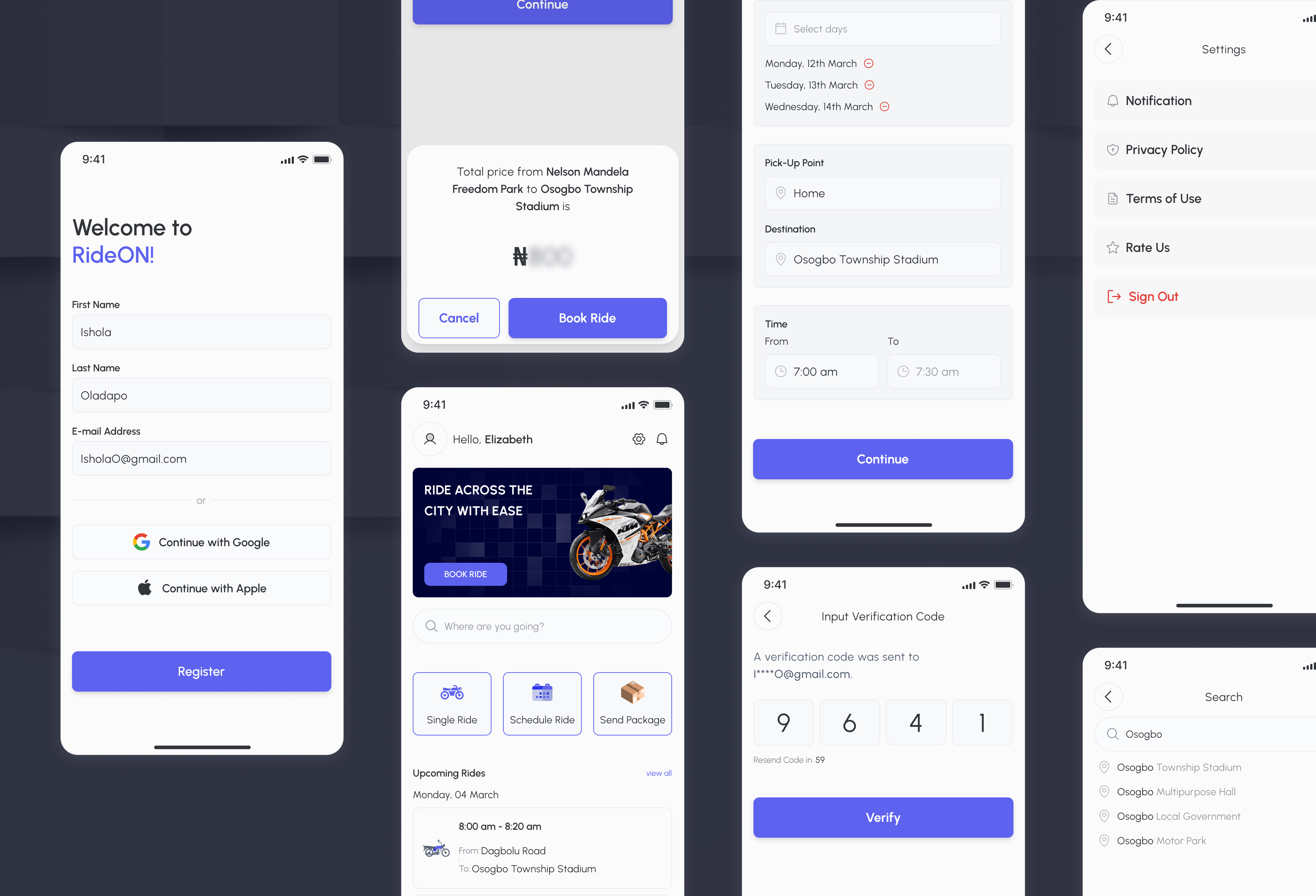
The core design decision: surface trust signals at the exact moment they're needed, not on a separate profile screen no one visits. Driver rating, number of trips, and vehicle verification appear directly on the booking confirmation — not after a tap.
The SOS button is always one thumb away, using a persistent bottom bar pattern. Share Trip was redesigned as a first-class feature, not a buried setting — because our research showed riders were already doing this manually.
Emergency contact button present on every screen during an active ride — not hidden in a menu.
One-tap live location sharing with saved contacts, replacing the screenshot workaround riders were already using.
Full driver stats — rating, trips completed, acceptance rate — surfaced at assignment, not buried in a tap-through.
Fare locked in at booking with transparent breakdown. No surge surprise at destination.
Trust drives
retention.
The redesigned app achieved a 60% reduction in booking flow completion time, driven by removing unnecessary decision points and surfacing trust signals earlier. Support tickets related to driver concerns and pricing disputes dropped by 40%.
Most significantly: repeat usage among female riders increased substantially after the safety-first redesign. Making riders feel safe wasn't just the right thing to do — it was the most powerful retention lever in the product.
"Safety features aren't secondary features. When your users are vulnerable, trust is the product."